Booking engine

Company overview
citizenM is a unique hotel chain that redefines the traditional hotel experience with its innovative approach to hospitality. With a focus on technology, design, and efficiency, citizenM offers a seamless and immersive stay.
Problem statement
The booking engine presents various challenges such as a lack of visuals of rooms/hotels, landing directly on the rates page without any context, and unclear room types and rates.
My role
In this project, I served as both a product designer and researcher. As a designer, I concentrated on making the interface user-friendly, while my research role involved understanding user behaviours and preferences.
Overview of the old experience
Missing information
The current rates page lacks essential information required for users to decide whether to stay at our hotel. Guests have difficulty finding details such as what is included in the room price, whether breakfast or other amenities are covered, cancellation policies, or if there are seasonal variations.

Confusing pricing structure
Users find it challenging to understand our pricing structure. The presentation of rates appears inconsistent, hidden fees, and unclear explanations of discounts or packages.

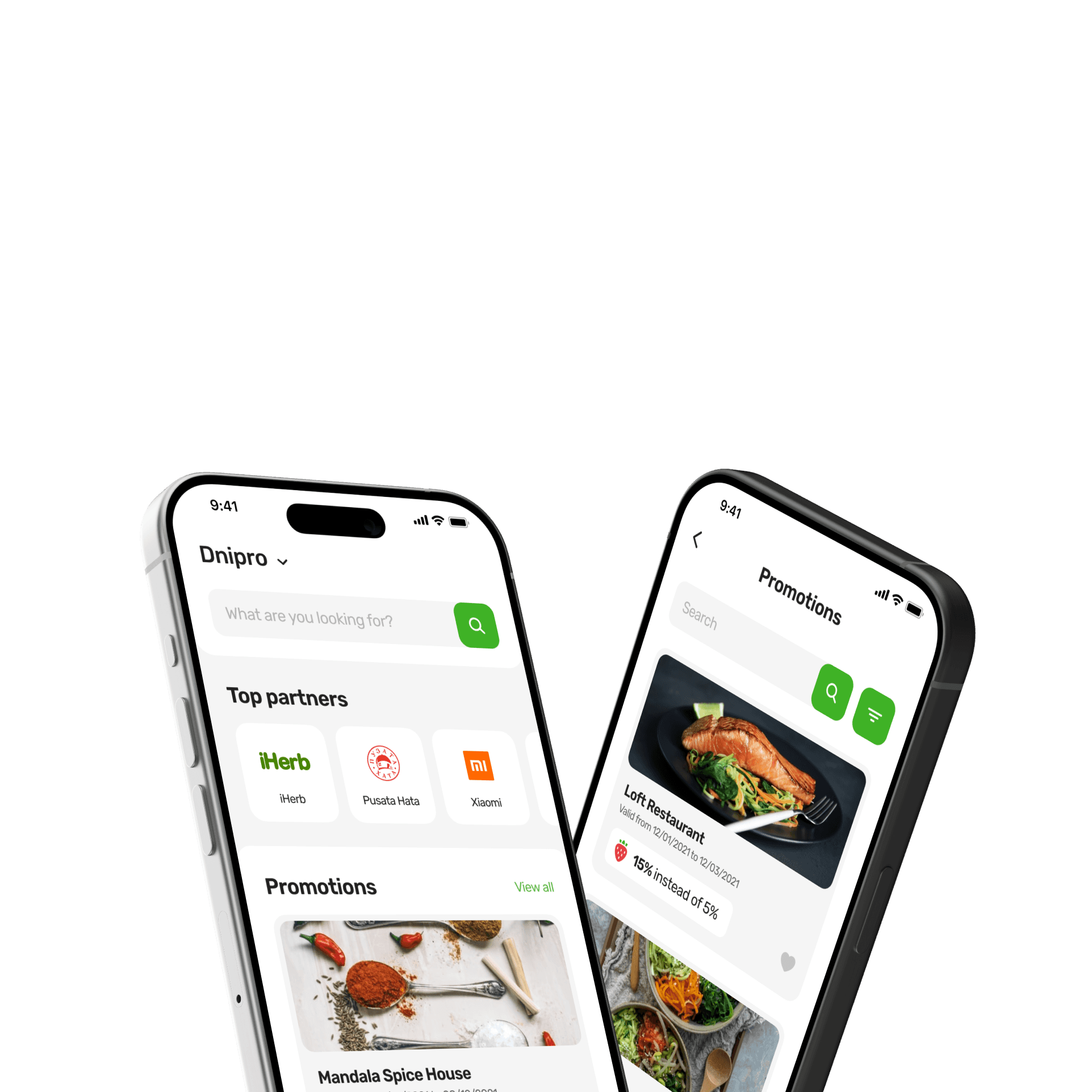
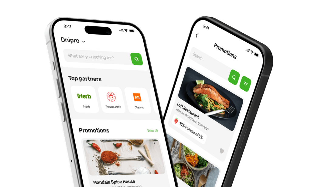
Desire for visuals
Users express a desire for more visual representations of both the rooms and the hotel itself. Many competing hotels showcase high-quality images, virtual tours, or even short videos that help potential guests imagine their stay. Without this, our page feels less engaging and less trustworthy.

Design sprint process
By organising a design sprint, I aimed to break from our routine tasks and brainstorm innovative solutions to enhance the overall booking experience for our customers.
Design sprint goal
Make our guests' booking experience simpler, better and bolder so that first-time guests feel happy, have an easy experience, feel like they belong and are valued.
Day #1
Problem mapping: taking time for clarity
Instead of immediately jumping into solutions, we made a deliberate effort to thoroughly understand the problem.
Day #2
Individual ideation: sketching detailed solutions
We encouraged independent brainstorming sessions where each team member could carefully sketch out their own detailed proposals.
Day #3
Decision efficiency: voting and deciders in action
We implemented a more structured approach by utilising a voting system and appointing a decision-maker to ensure that our team's priorities.
Day #4
Prototype facade: testing before perfecting
We recognised the value of quick iteration and experimentation. Therefore, we decided to develop a simplified prototype, acting as a facade, to test our ideas practically.
Day #5
Customer validation: honest reactions from target audience
We actively sought feedback from our target customers by presenting them with our prototype and soliciting their honest reactions and insights.


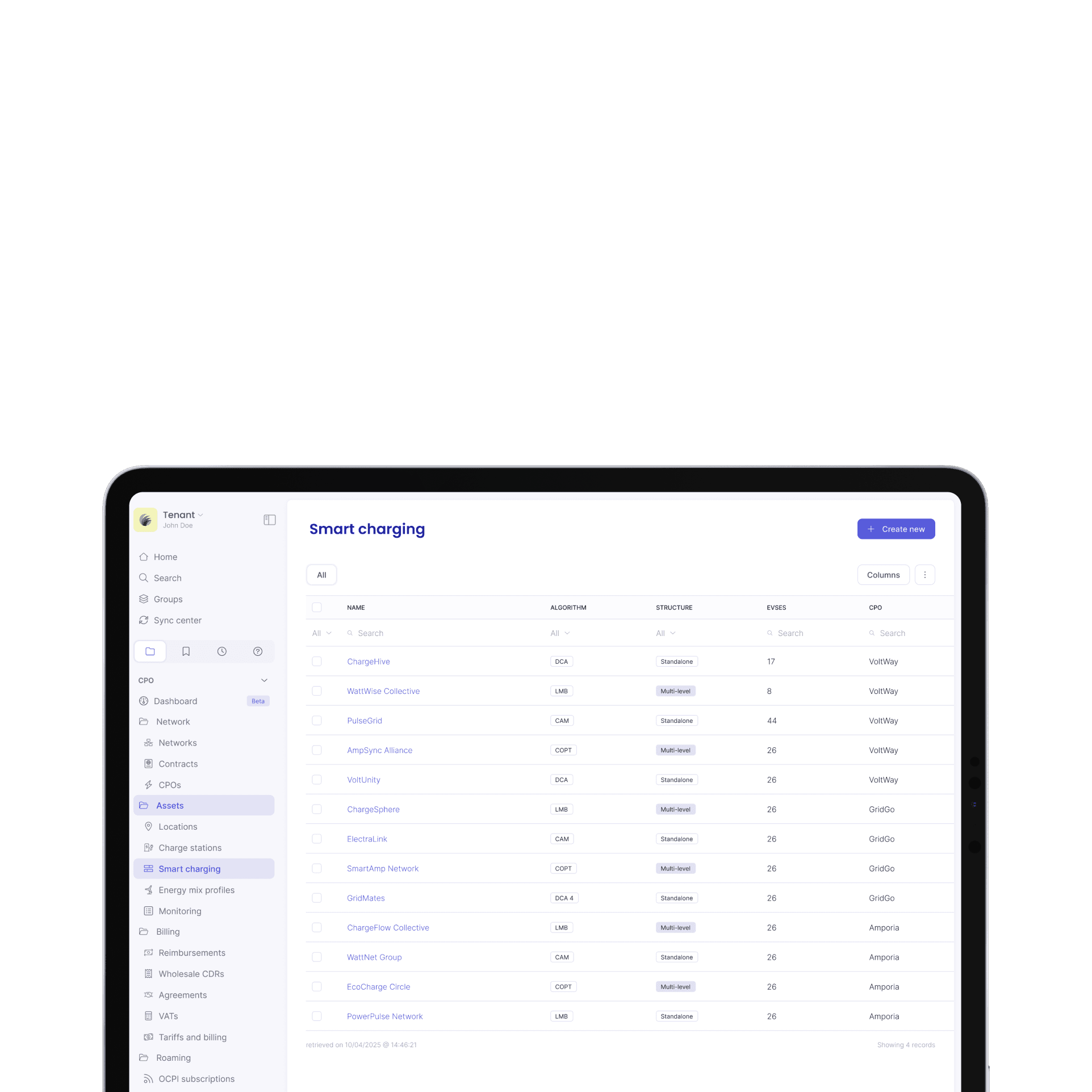
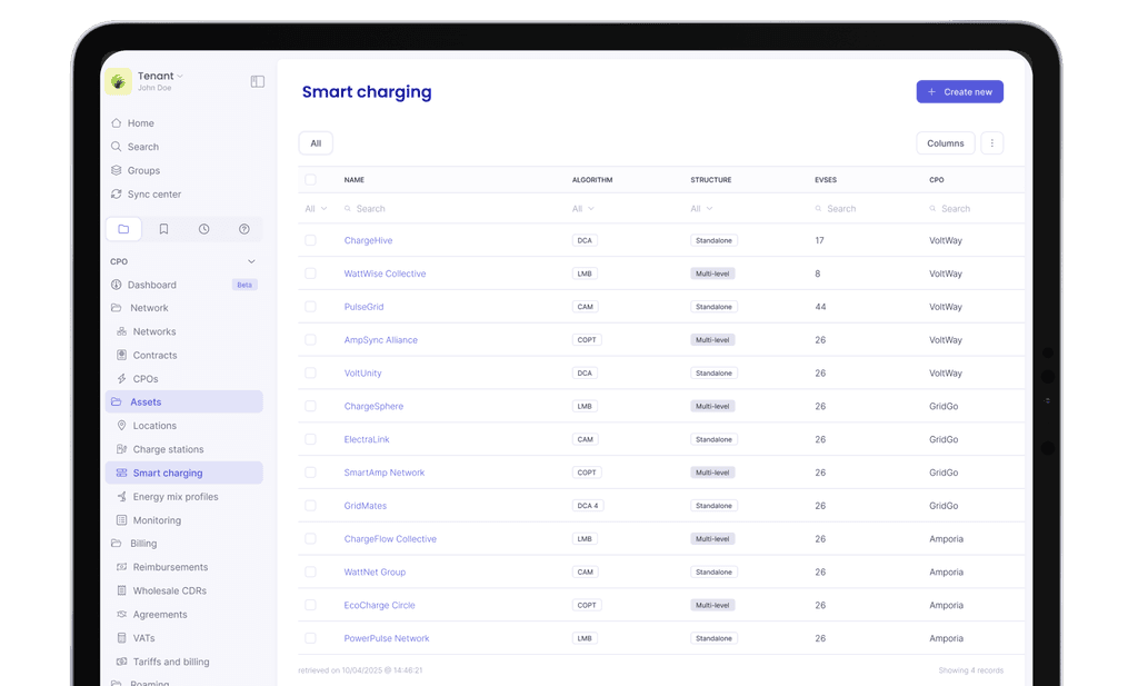
Design solution

Simpler: one click away from the payment page.

Better: now all visuals are in place

Better: now it's clear that the hotel has only one room type.

Bolder: stay configuration instead of separate add-ons page

Insights from testing with users
The interviews gave us the confirmation that the prototype of the booking experience has potential and promising components. However we also noticed we can make it even better, further iteration needs to be explored and tested again.
Quote #1
“Simple, streamlined, easy, transparent”
Quote #2
“Better than other booking platforms”
Quote #3
“Hotel chain with boutique character”
Next steps
Benchmark usability and customer experience against competitors within and outside the industry.
Integrate winners from A/B tests into the new flow, ensuring relevance to the user experience.
Implement iterations in the prototype based on identified opportunities for improvement.
Test the new designs on our website with real users.